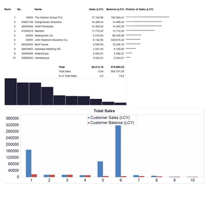
Sometimes it is nice to have some kind of visualization tied to a list report. ForNAV provides two controls to enable this: Sparkline and Chart.
For example:
Data Table
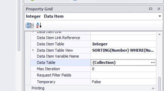
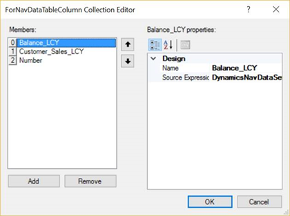
To get started, you need to define a Data Table, which can be found in the Property Grid for each data item. In the Data Table row, click the assist edit button (…) to define the columns in the table:
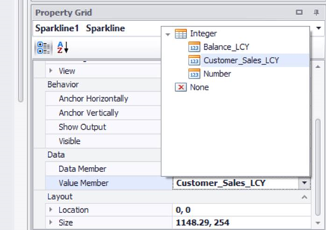
Sparkline
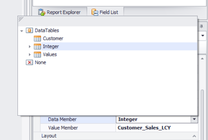
To create a Sparkline, you simply drag in a new Sparkline control from the toolbox. Then, in the Data Member field, select the Data Table that you just created. Then in the Value Member field, select the value you want the Sparkline to display:
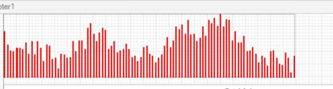
When you run the report, the result will look like this:
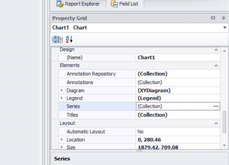
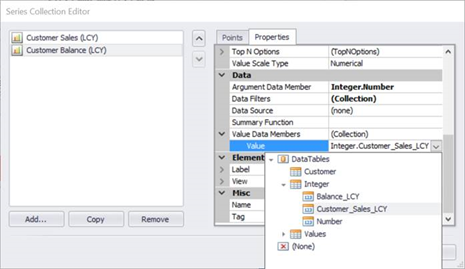
Chart
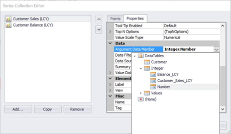
To create a chart, you drag in a Chart control from the toolbox and use the wizard to choose the control layout. To choose the series that you want, click on the assist edit button for Series and select the Argument Data Member for your x-axis and Value for your y-axis:
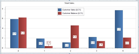
The result looks like this:
The controls used were created by DevExpress and further documentation can be found here: https://documentation.devexpress.com/#WindowsForms/CustomDocument8117